Color is more than a visual experience; it is a language that communicates emotion, depth, and cultural history. Whether you are a digital strategist looking to enhance brand impact or a realist painter trying to capture the subtle glow of a sunset, mastering color theory is essential. It is the bridge between scientific optics and artistic expression.
Drawing from my work with cinematic landscapes and visual storytelling, I’ve curated these five titles to take you from the fascinating origins of pigments to the advanced technical application of light in modern design.
The 5 Best Books On Color Theory
1. The Secret Lives of Color
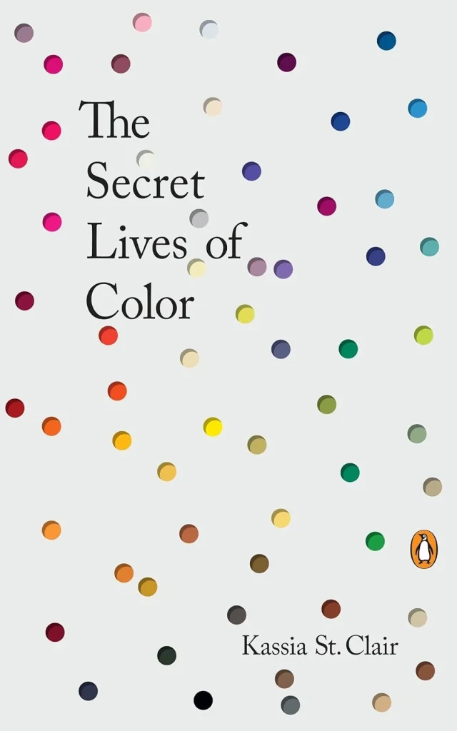
Author: Kassia St. Clair
Publication Date: October 24, 2017
My Review
Kassia St. Clair has created a “dazzling” historical compendium that explores seventy-five fascinating shades. This book isn’t just about art; it’s about human civilization. You’ll learn how the color white protected against the plague and why imperial purple was so exclusive.
This book is highly recommended for those who want to understand the why behind our favorite hues. It turns color into a vivid narrative thread that runs through fashion, politics, and war.
2. Color and Light: A Guide for the Realist Painter
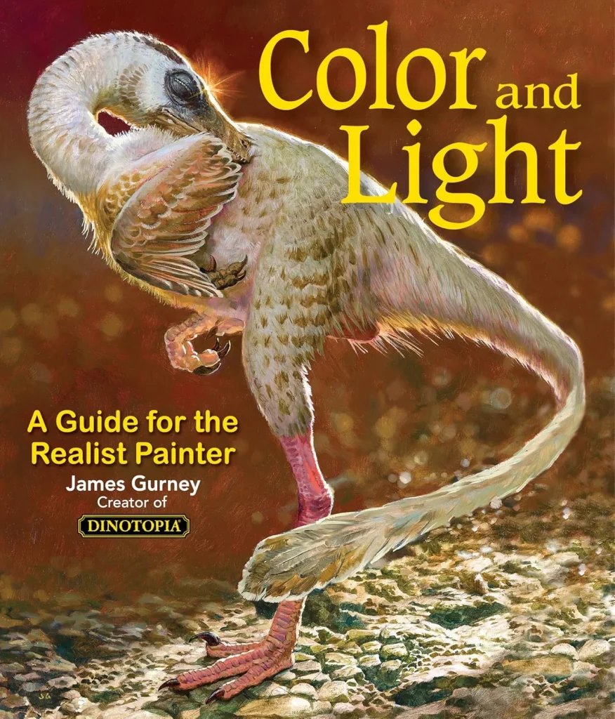
Author: James Gurney
Publication Date: November 30, 2010
My Review
James Gurney, the visionary behind Dinotopia, bridges the gap between scientific explanation and artistic observation. He examines how light reveals form and provides an indispensable study of atmospheric effects.
It is an essential tool for any artist—from beginner to expert—who wants to understand how light interacts with surfaces in the real world. Gurney’s ability to cut through “dogma” with science makes this a definitive resource.
3. Making Color Sing
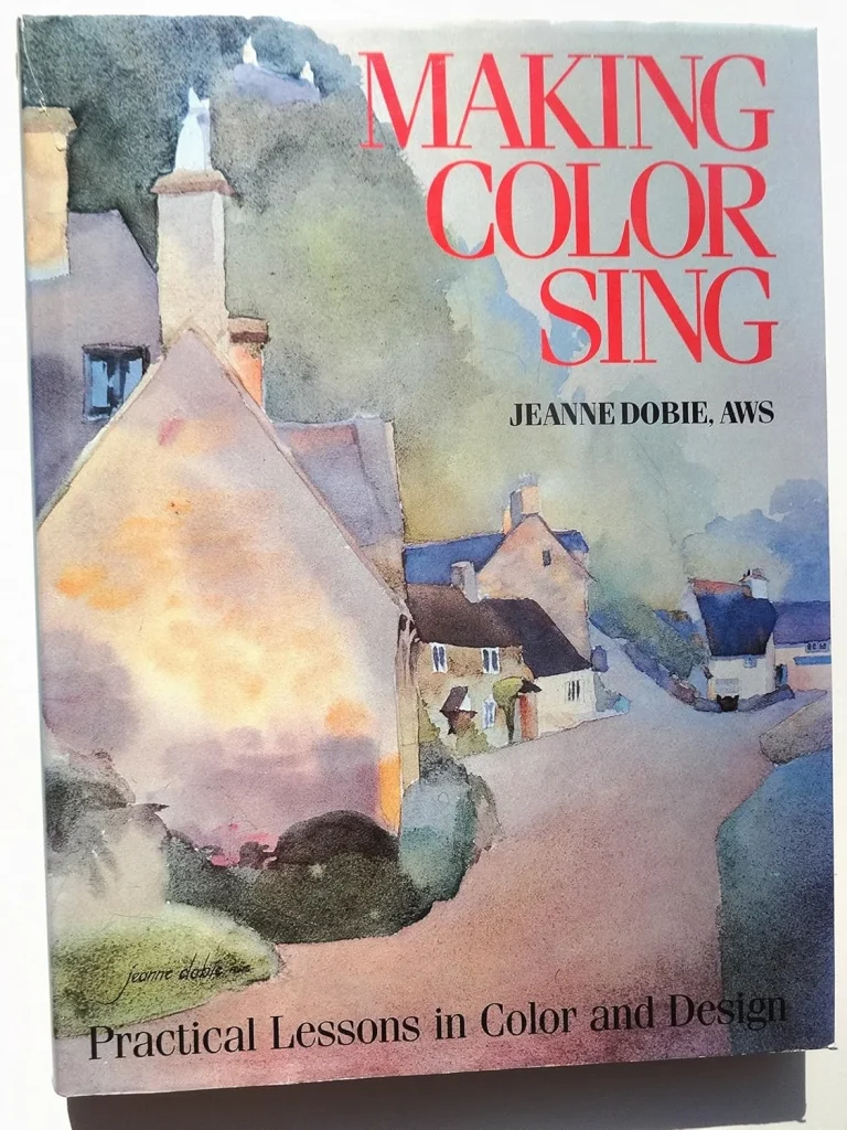
Author: Jeanne Dobie
Publication Date: January 11, 2011 (25th Anniversary Edition)
My Review
Jeanne Dobie’s classic focuses on the relationships between colors. Through 31 clear exercises, she teaches how to use the “push and pull” of warm and cool tones to create space and how to generate “vibrations” through complementary colors.
This book is perfect for those who want to move beyond literal representation and use color to communicate personal impressions and dynamic compositions.
4. Artists’ Master Series: Color and Light
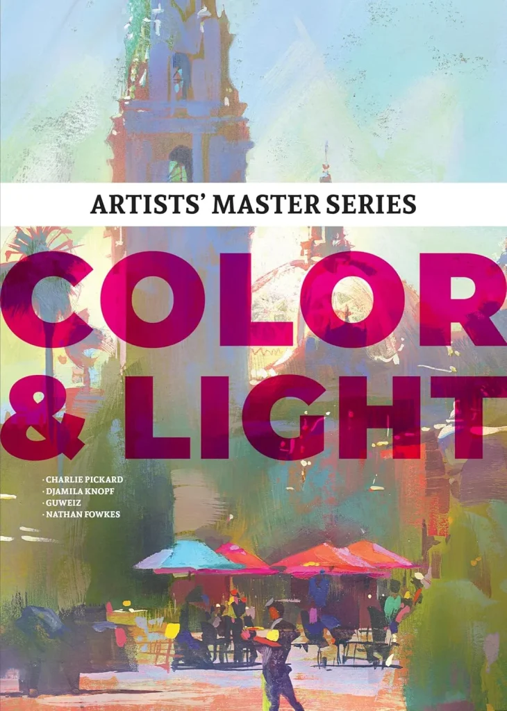
Editor: 3dtotal Publishing
Publication Date: April 5, 2022
My Review
For digital artists and character designers aiming for a “world-class” level, this volume is the key. Industry experts reveal advanced techniques to infuse characters with recognizable and admired color schemes.
It features in-depth tutorials and case studies that focus on the “master-level” nuances of lighting. It is highly recommended for those working in concept art, gaming, or animation who need to elevate their work to a professional standard.
5. 1,500 Color Mixing Recipes
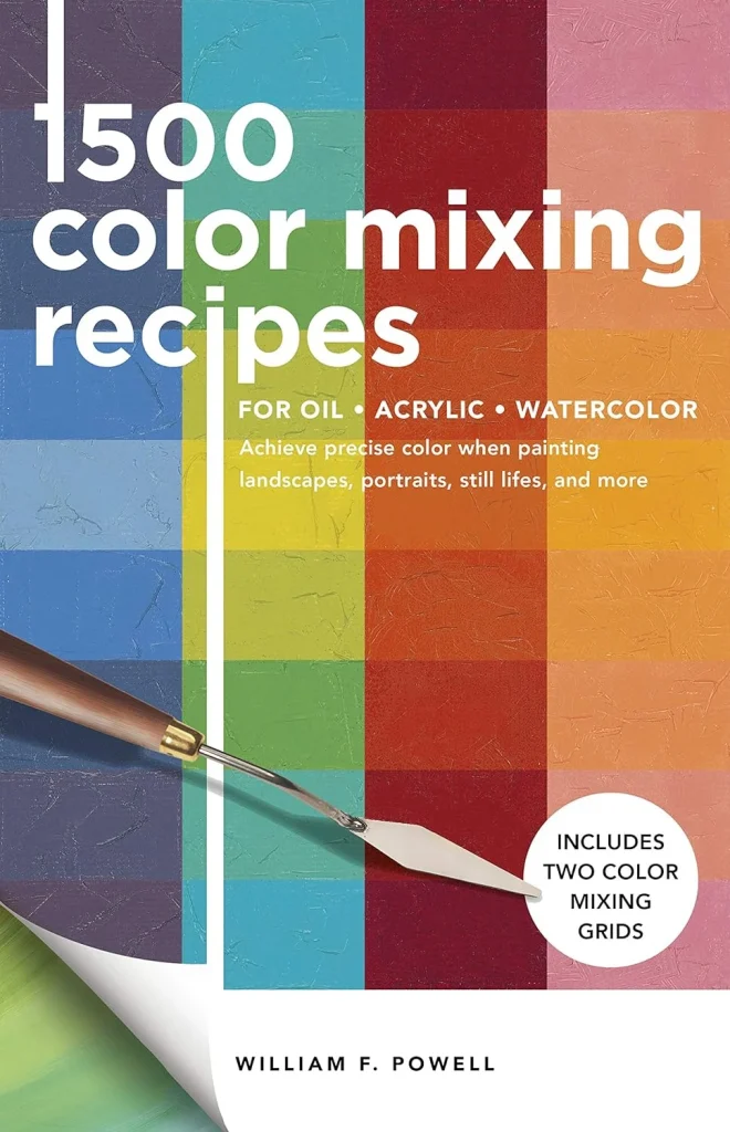
Author: William F. Powell
Publication Date: June 22, 2021
My Review
This is the “definitive color-mixing resource” for painters working in oil, acrylic, or watercolor. Powell provides a practical, four-step system to achieve precise colors—from the specific green of broccoli to the subtle tones of a portrait.
It is a user-friendly compendium that removes the guesswork from the palette. It is highly recommended for artists who find themselves frustrated by “muddy” colors and want a scientific, repeatable way to mix the exact hue they need.
Core Concepts of Color Theory
To use color effectively, you must understand the three fundamental properties that define every shade:
- Hue: The actual name of the color (Red, Blue, Green).
- Value: How light or dark a color is. Mastering value is often more important than color choice for creating realistic depth.
- Saturation (Chroma): The intensity or purity of the color. A high-saturation color is vivid, while low saturation appears grayed out.
The Interaction of Color
As Jeanne Dobie notes, “no color exists in isolation.” The way we perceive a color changes based on what is next to it:
- Simultaneous Contrast: A neutral gray will look “warm” if placed next to a cold blue, and “cool” if placed next to a fiery orange.
- Warm vs. Cool: Warm colors (reds, yellows) tend to “advance” toward the viewer, while cool colors (blues, purples) tend to “recede” into the background.
Conclusion
Building a library on color theory ensures you have both the historical context to inspire your work and the technical precision to execute it. Whether you are reading about the “Secret Lives” of pigments or following a “Recipe” for the perfect landscape, these books will help you see the world in a more vivid spectrum.
Are you looking to improve your technical painting skills with light and form, or are you more interested in the historical and cultural stories behind different pigments?

Leave a Reply